540 Motel
A place which you can call a temporary home
Brand Identity, Re-branding, Visual Communications
2017
Designed for:
The Blackstone Group
2017
Designed for:
The Blackstone Group
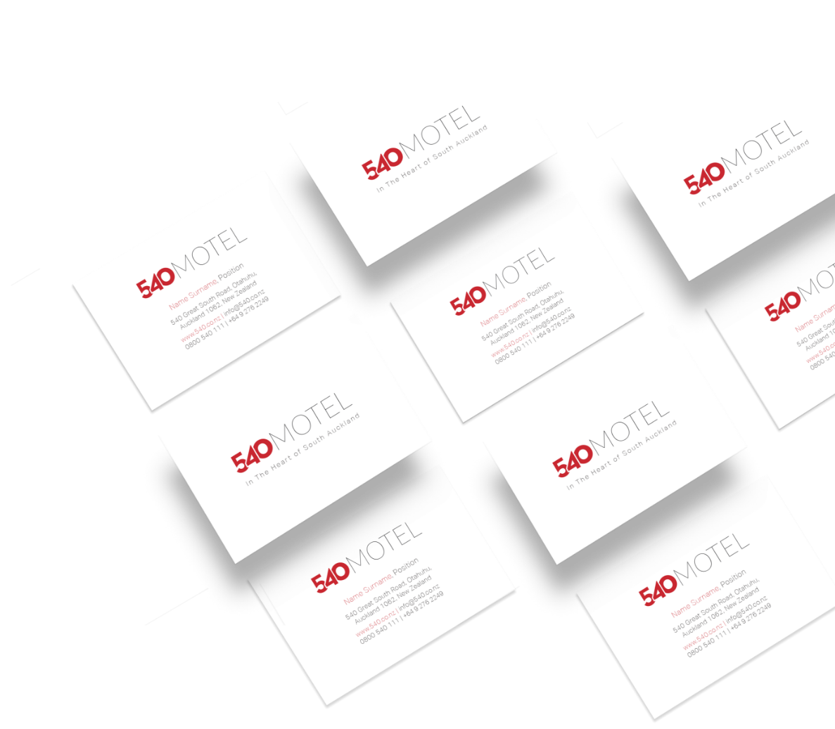
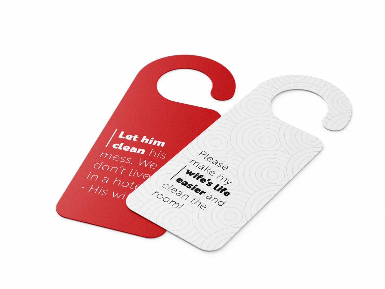
With renovating a motel 540, Blackstone Group decided to redesign a brand identity for Motel 540. The goal was to come up with a fresh look which shows that they are up to trends in all aspects - not only with services they provide but also how they communicate that to their clients.
They required to keep the brand red colour and numbers 540 as their recognizable elements. I created a modern, modular look, where can particular components be used as single elements, or they can work well together. Using non-serif typography, where I played with a thickness of letters, gave a dynamic to brand identity.
They required to keep the brand red colour and numbers 540 as their recognizable elements. I created a modern, modular look, where can particular components be used as single elements, or they can work well together. Using non-serif typography, where I played with a thickness of letters, gave a dynamic to brand identity.
Brother 1816 - Light
Lorem ipsum dolor sit amet, consectetur adipiscing elit, sed do eiusmod tempor
incididunt ut labore et dolore magna aliqua. Ut enim ad minim veniam.
Brother 1816 - Black
Lorem ipsum dolor sit amet, consectetur adipiscing elit, sed do eiusmod tempor
incididunt ut labore et dolore magna aliqua. Ut enim ad minim veniam.

Red
#C62023

100% Black
#000000

0% Black
#FFFFFF


 PREVIOUS